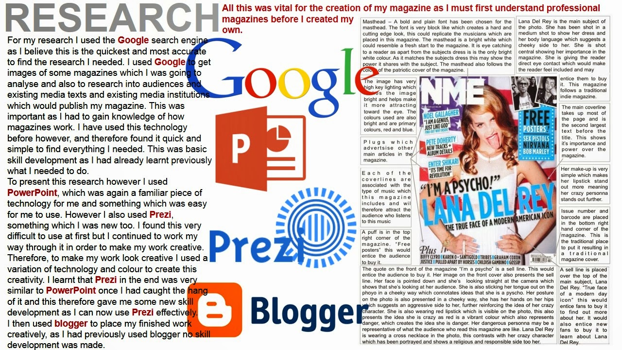
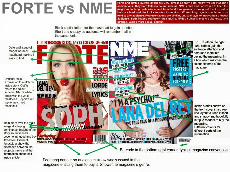
Monday 3 March 2014

Front Page (Final Version) & Changes

What's changed:
This is the final version of my front image. I have took the constructive criticism from the peer assessment and I have added a larger version of the date in the bottom corner where there was a blank space near the barcode. This makes it easier for my target audience's to find and read the price.
I decided to make few changes due to the amount off positive feedback from my class peer assessment

Contents Page (Final Version) & Changes


What's changed?
I have taken the constructive criticism from my class peer assessment and I have placed my issue number and changed my date to a month rather than a specific date. This makes my magazine look professional and follow the conventional rules of a typical music magazine. 
I chose to make few changes due to the positive response from my class peer assessment. 
I then got teacher feedback to which I changed the Album Reviews to my own images which I created. The top left image is a background which I created in Photography in Year 11 for my exam and the rest are images I have taken on my camera. I edited these images in Photoshop to then make them look like real album covers. 

Double Page Spread (Final Version) & Changes


What's changed?
I have added an extra line to my introduction in order to give people a clearer idea of what my double page spread includes. I then made my text smaller to make the magazine look more professional, this then left me room to make an extra paragraph to inform readers about  the subjects up coming album, which the article is about. All of these changes also make my magazine look professional. I also decided to add the "Photography and Article by Rebecca Browne (Executive Director) to make the DPS much more professional and so the audience can refer to who wrote the article for future reference and possibly take interest in their other work.
I decided to make few changes due to the positive response from my class peer assessment.
After gaining some teacher feedback I decided to make my font smaller ad add an extra paragraph into my interview to fill the page more. I also added a quote into the bottom right of the page in order to fill up the page and make my double page spread more professional.

Friday 31 January 2014

Question 4 - Evaluation


In conclusion my audience are teenagers/young adults ranging from ages 16-30 with socio-economic group of either E due to being a student or D as my audience are young so their job won't be anything skilled or middle class.
The indie and indie rock audience both fit into a struggler or reformer pyschographic profile.